HEIMO ZOBERNIG – this not this / EI ARAKAWA-NASH – Cologne of the Maghreb (Bodyphilia Song)
Galerie Meyer Kainer•May 29, 2026 — Jul 31, 2026


More Exhibitions at Galerie Meyer Kainer


Guestbook
Press Release
FAKING THE REAL
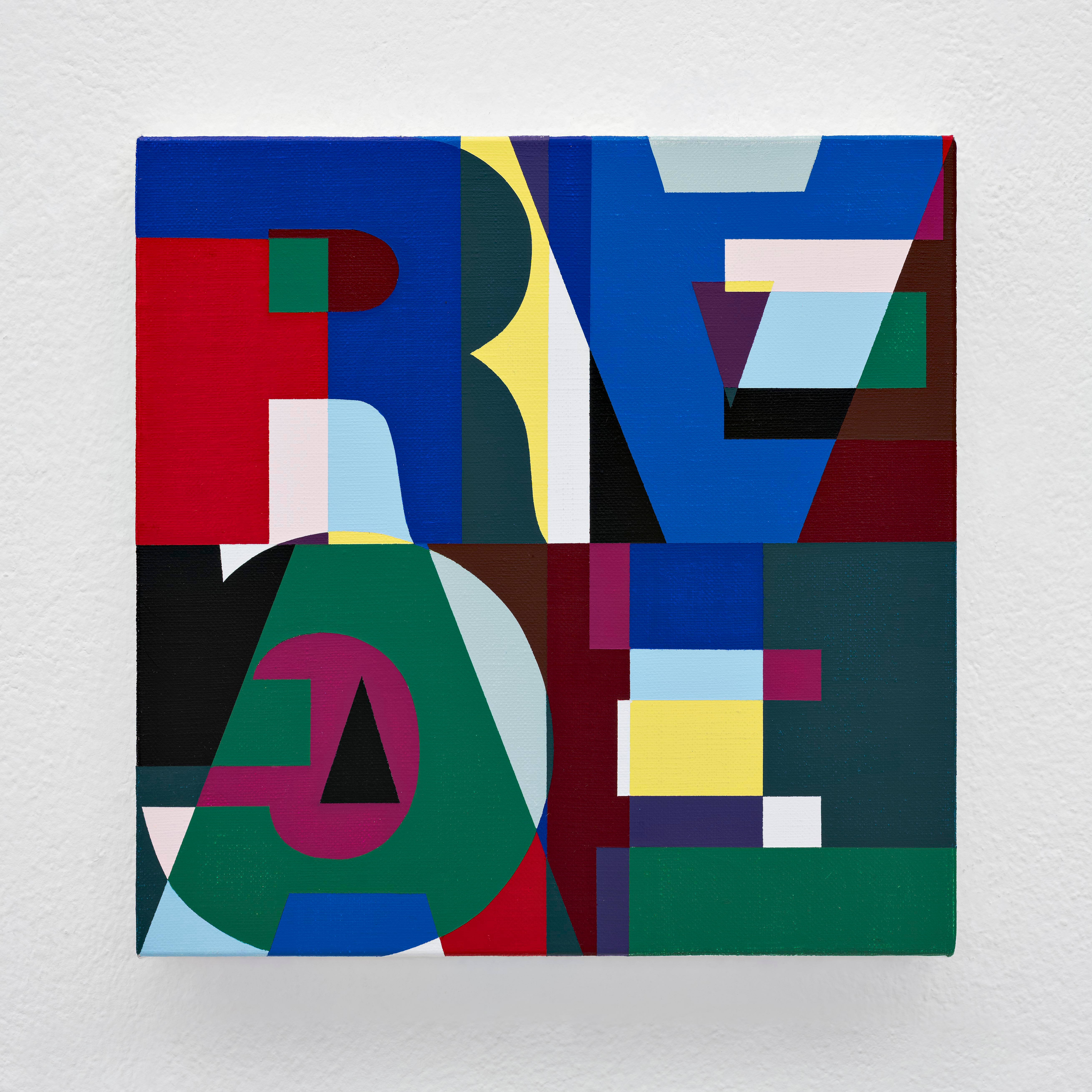
Since the 1980s, the ‘anti-essentialist system’ practiced by Heimo Zobernig has functioned as a consistently applied negative dialectic in his art. Within this, Zobernig regularly explores the question of the manipulation of realities.
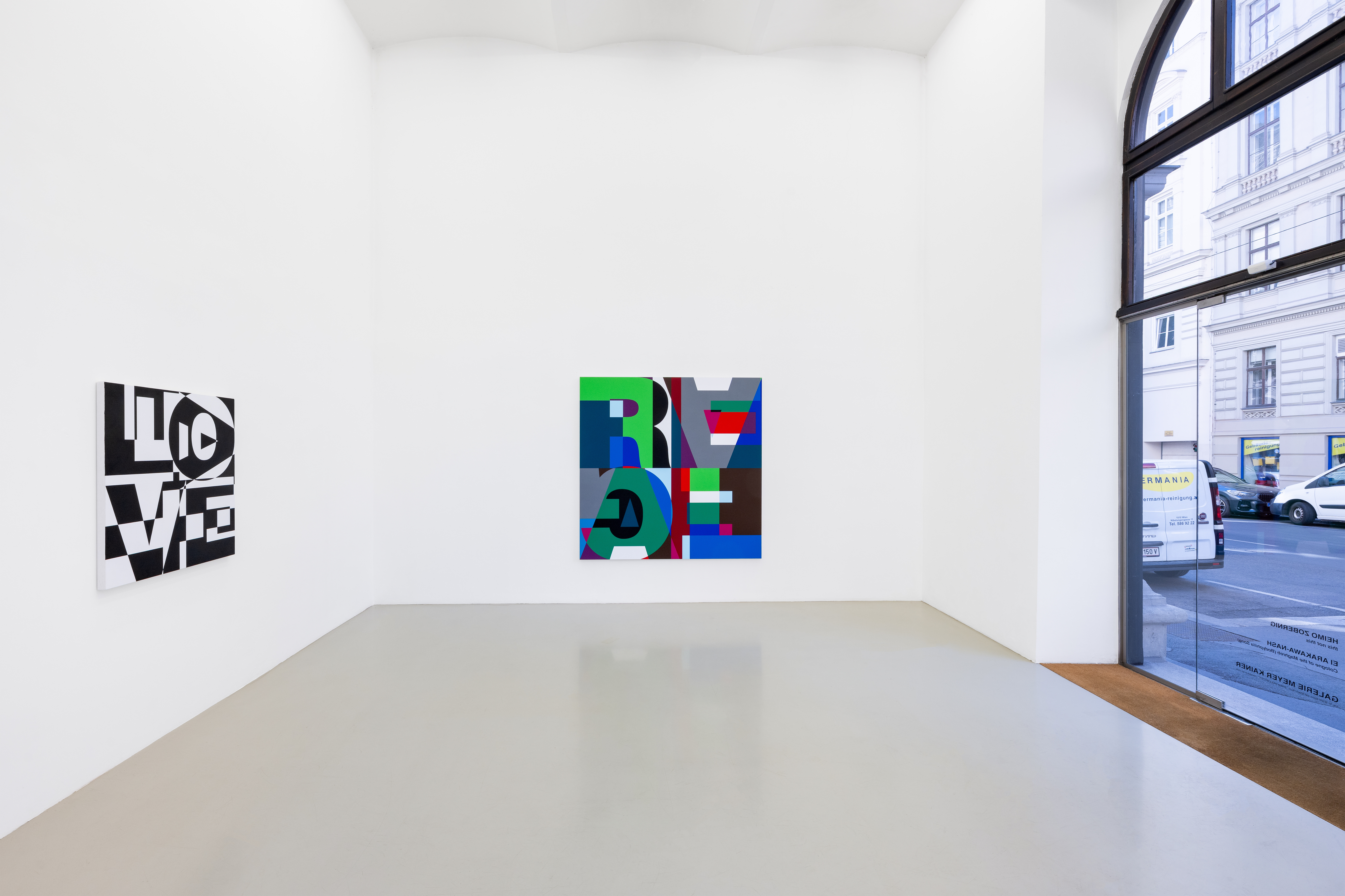
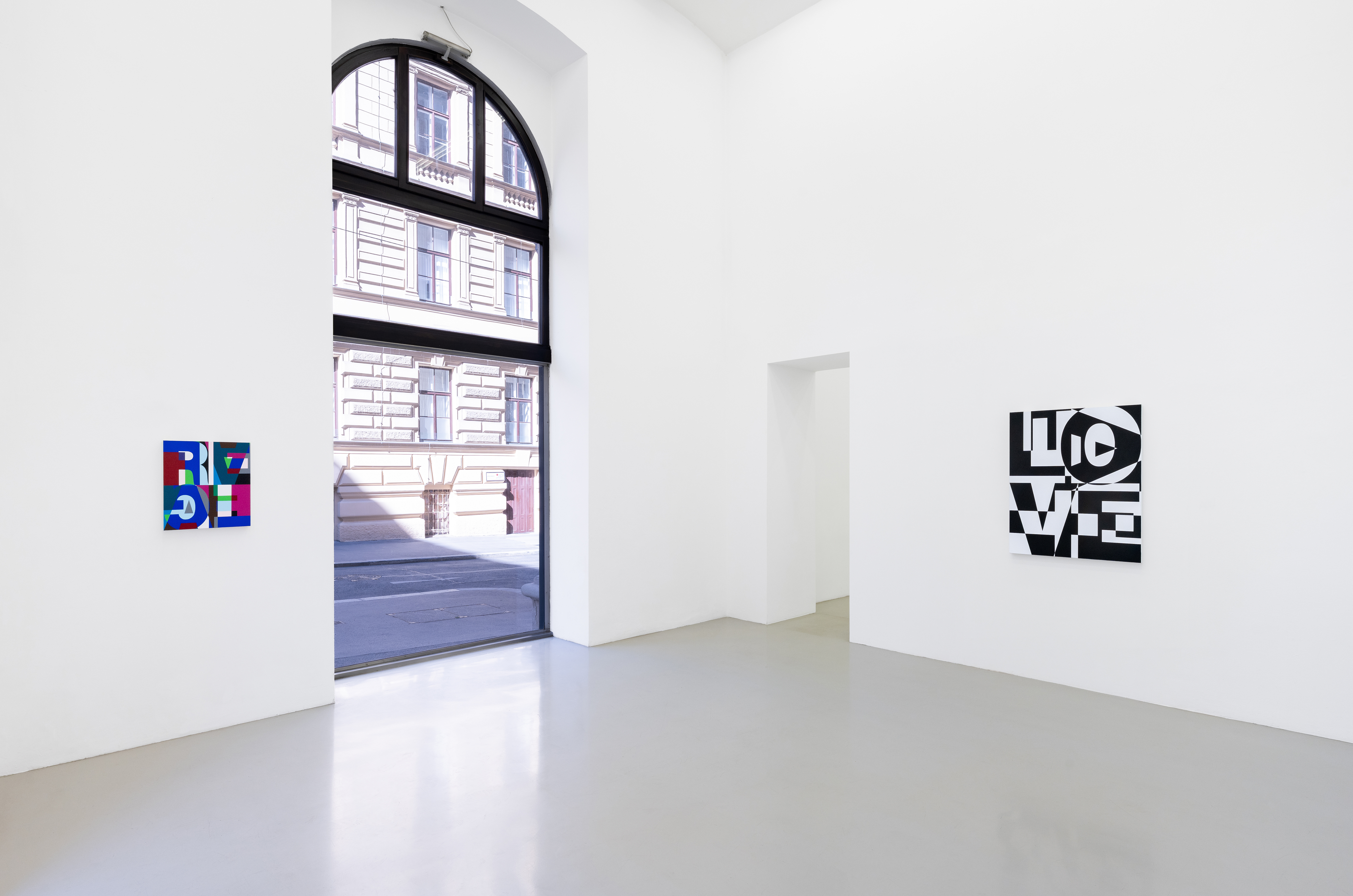
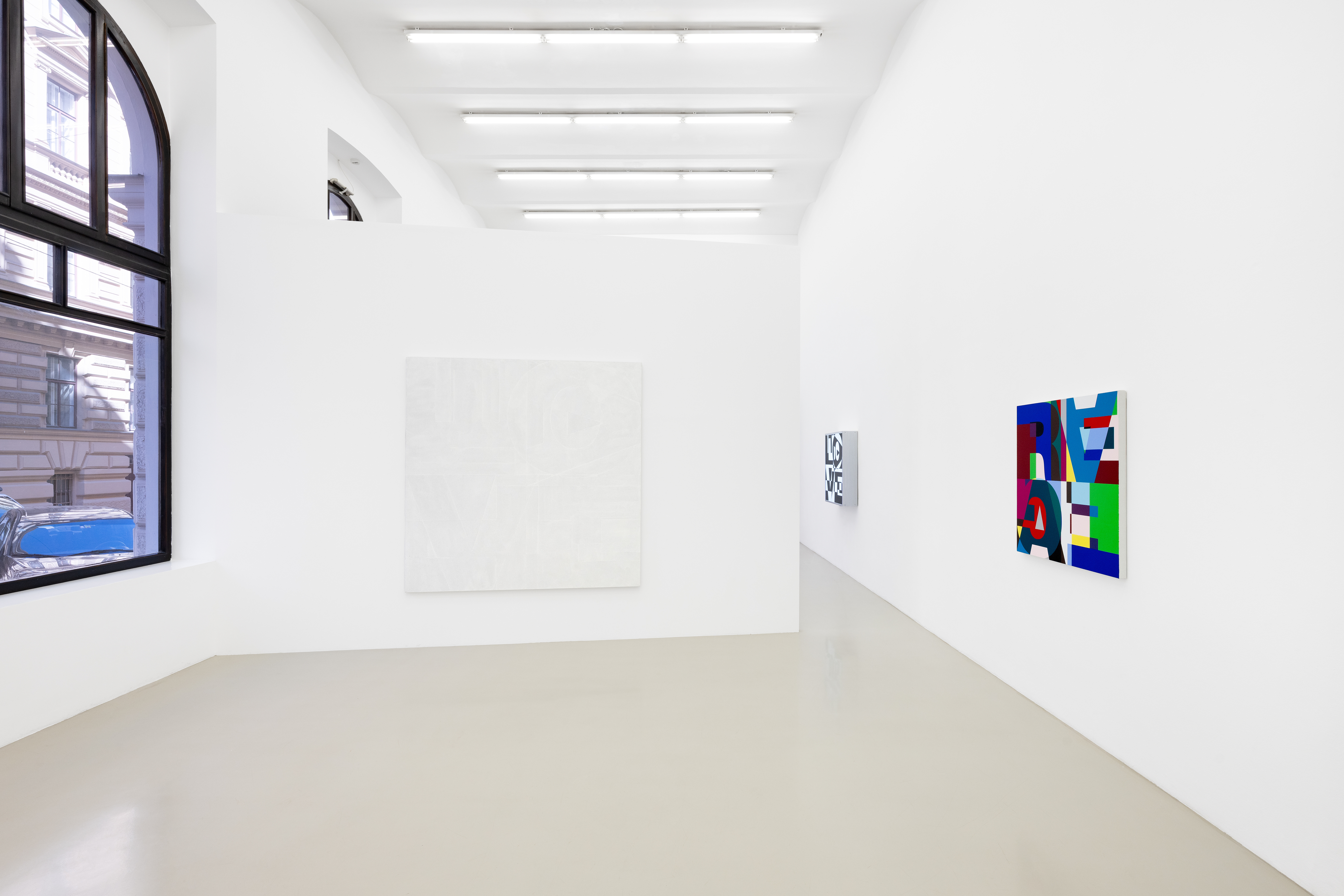
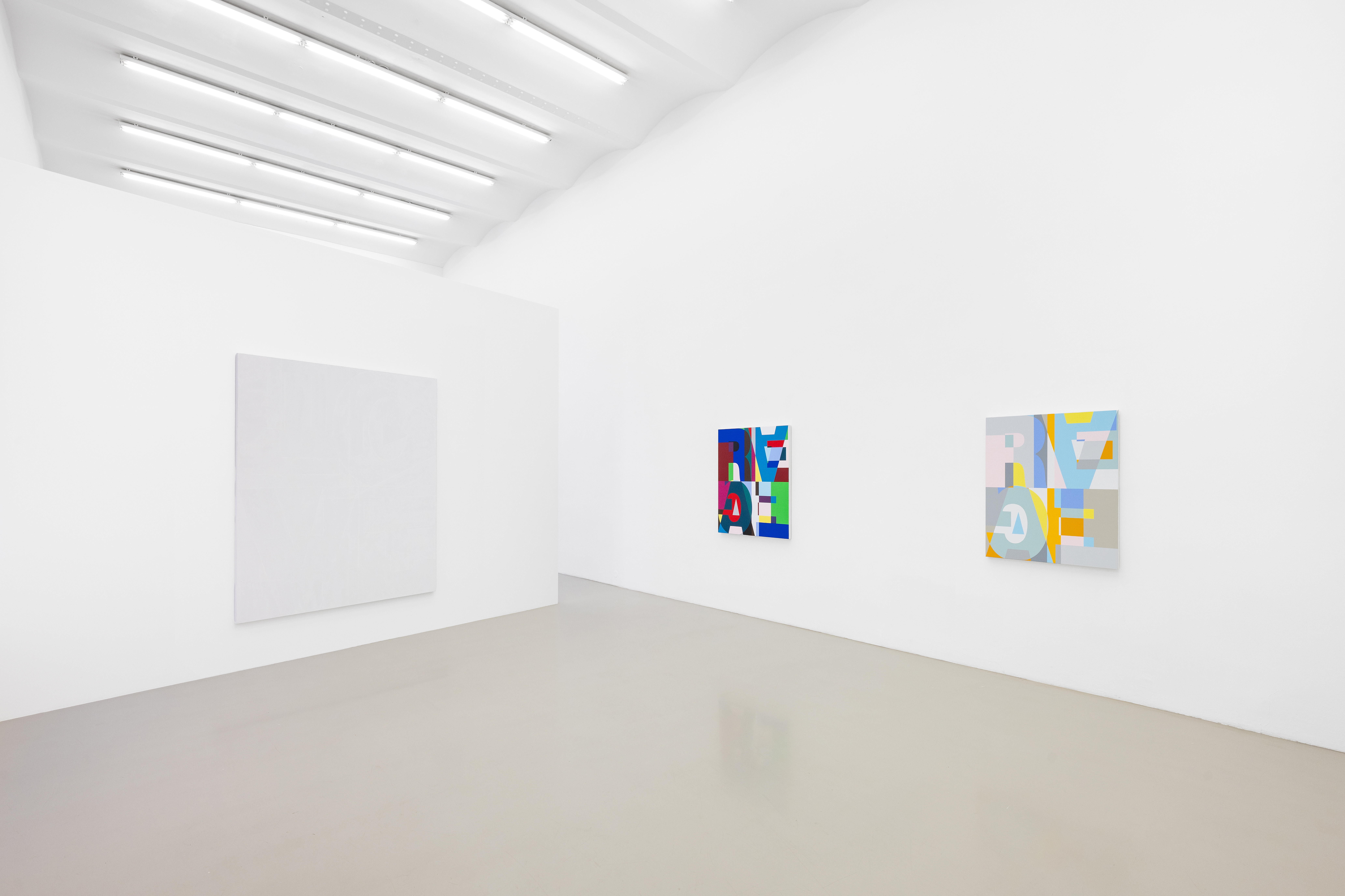
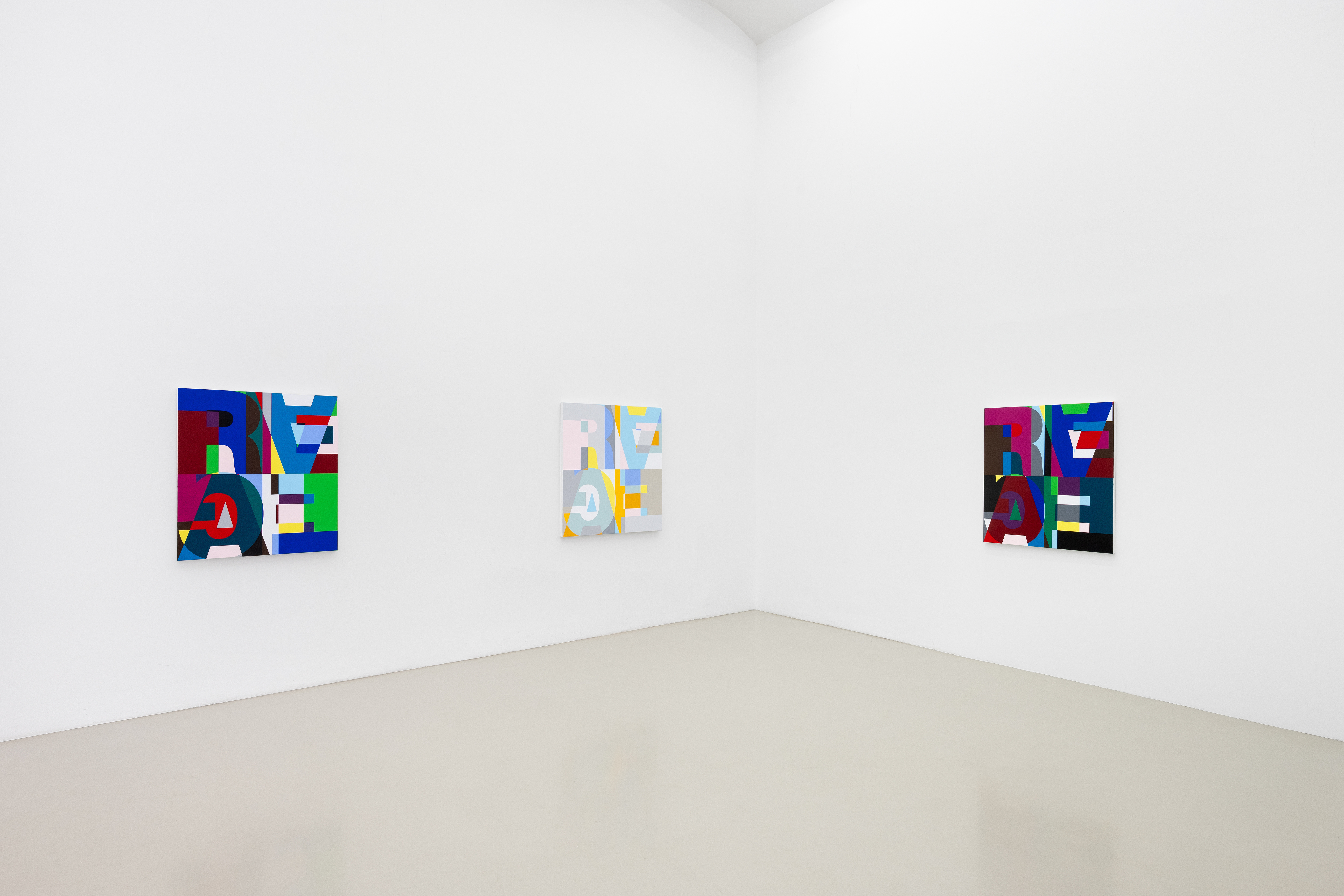
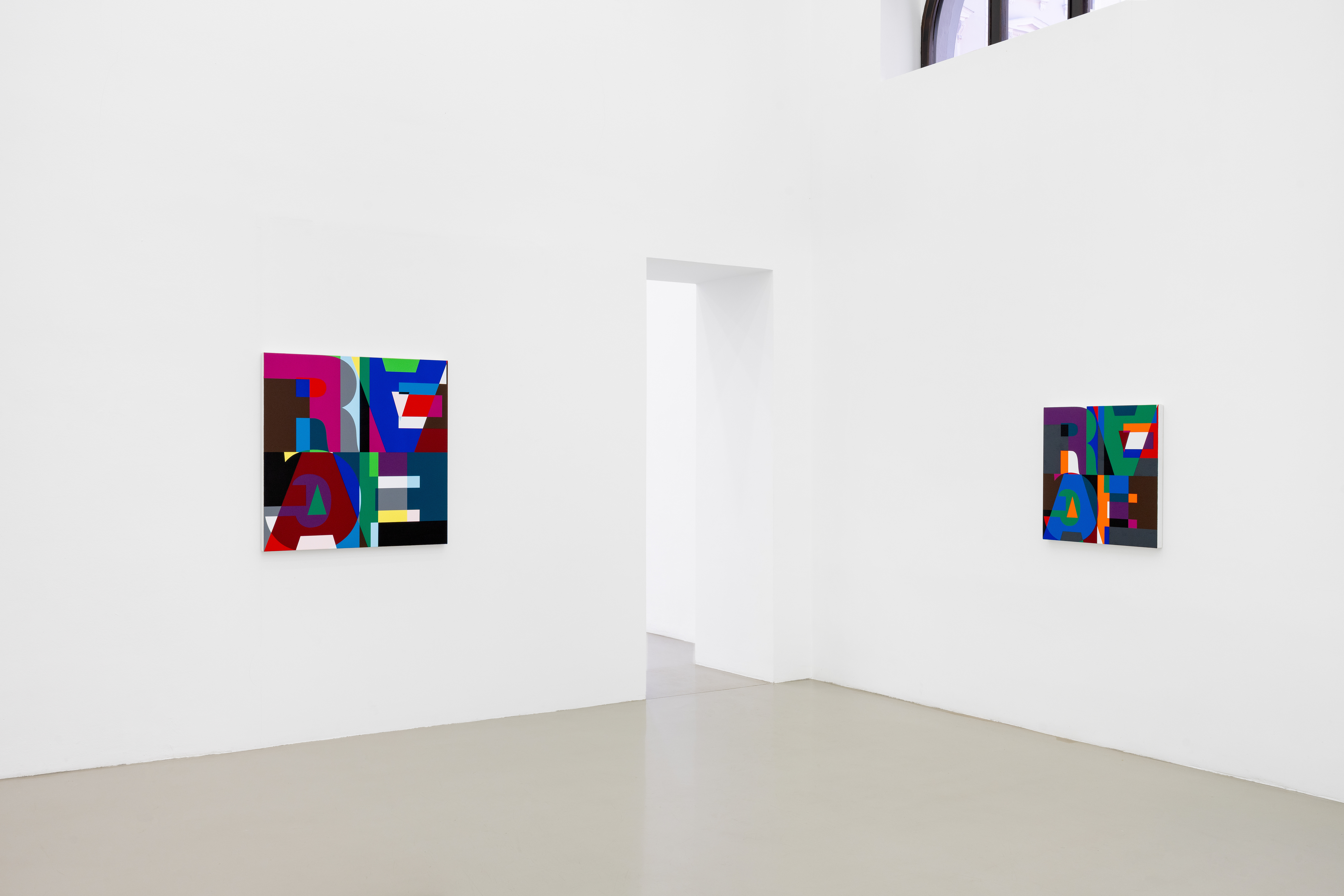
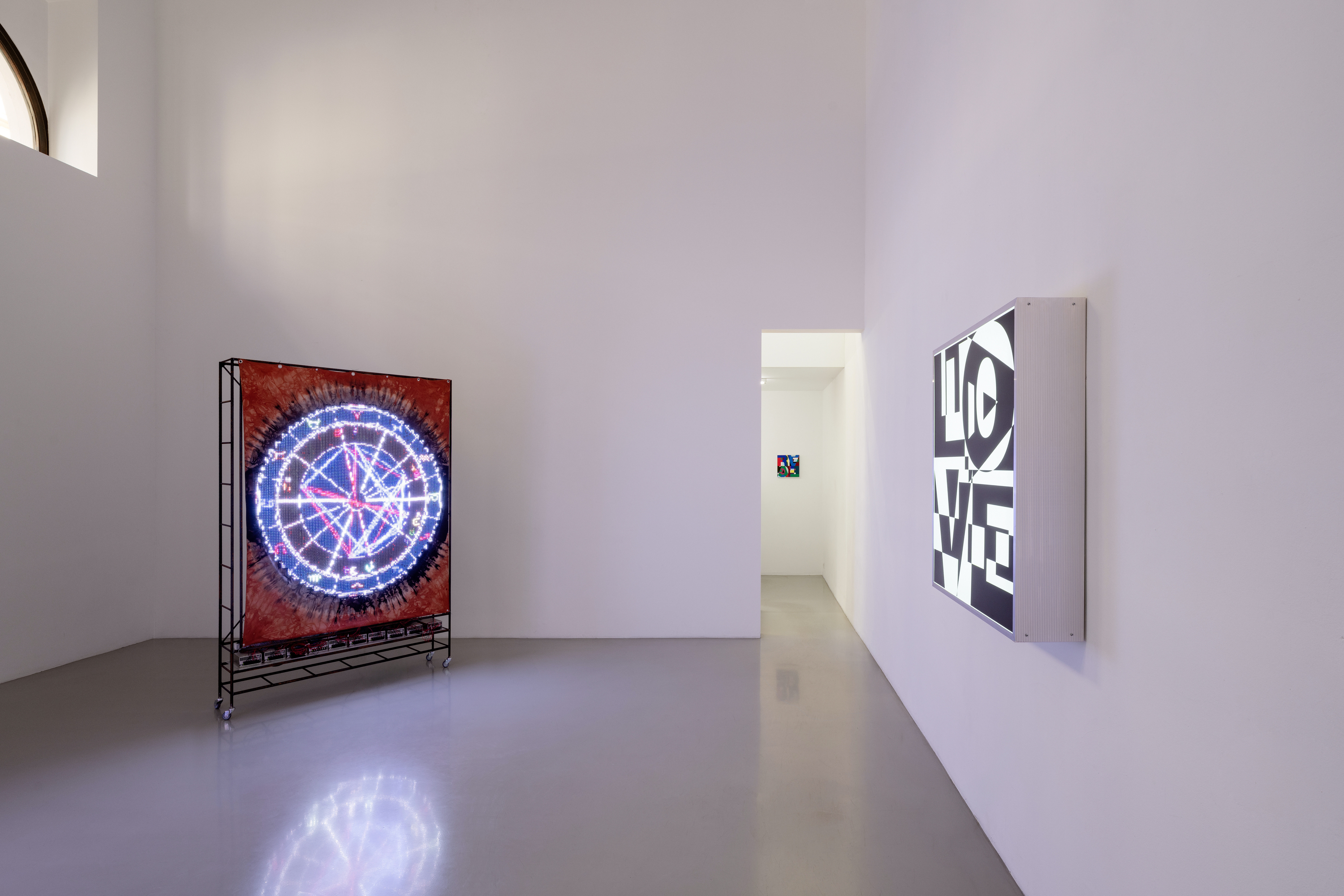
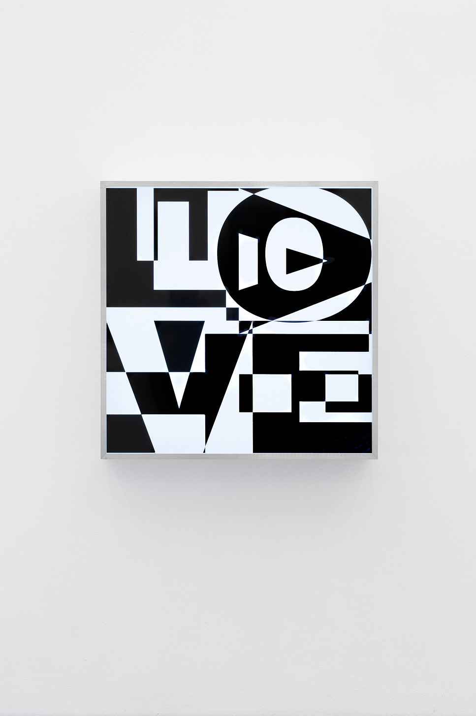
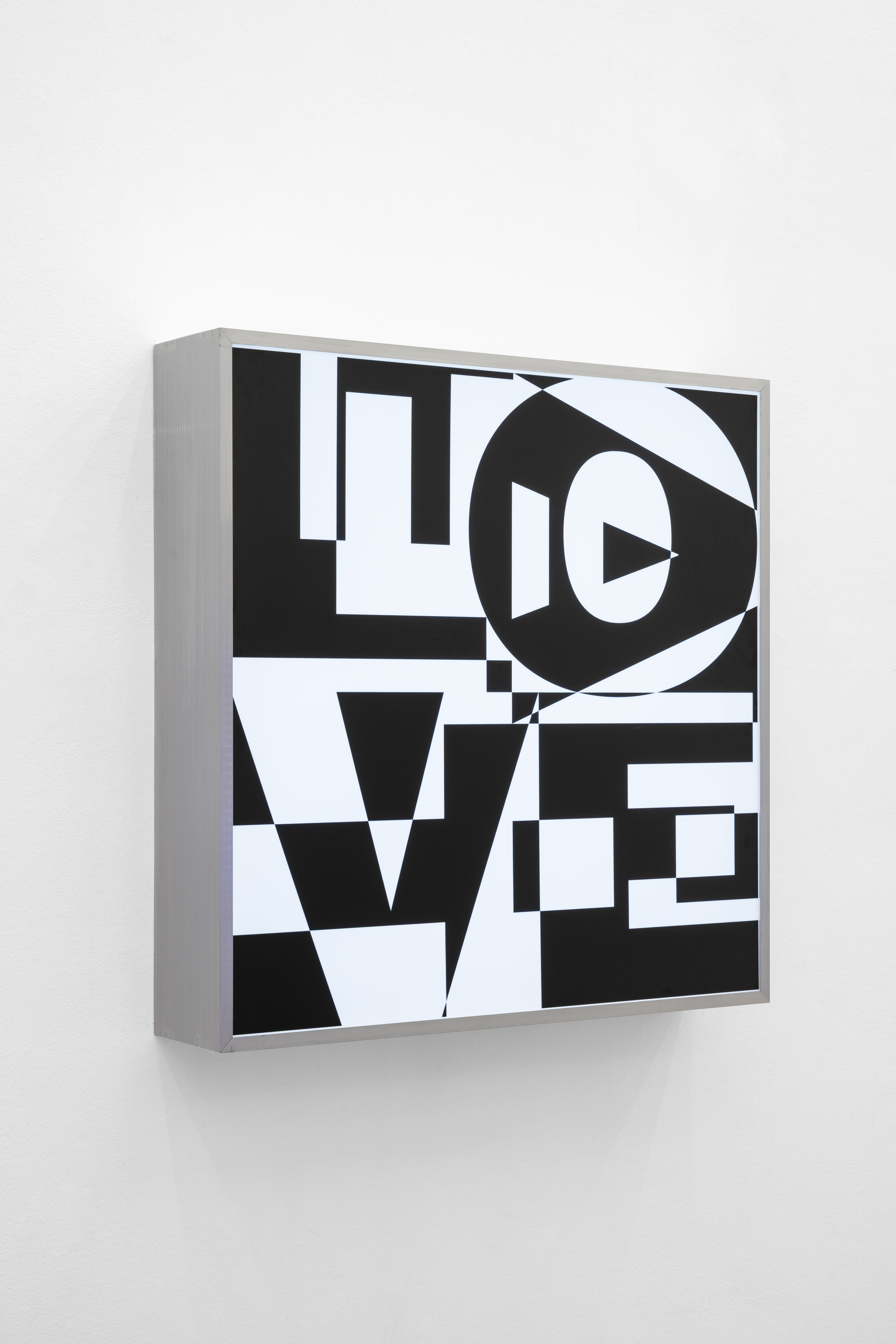
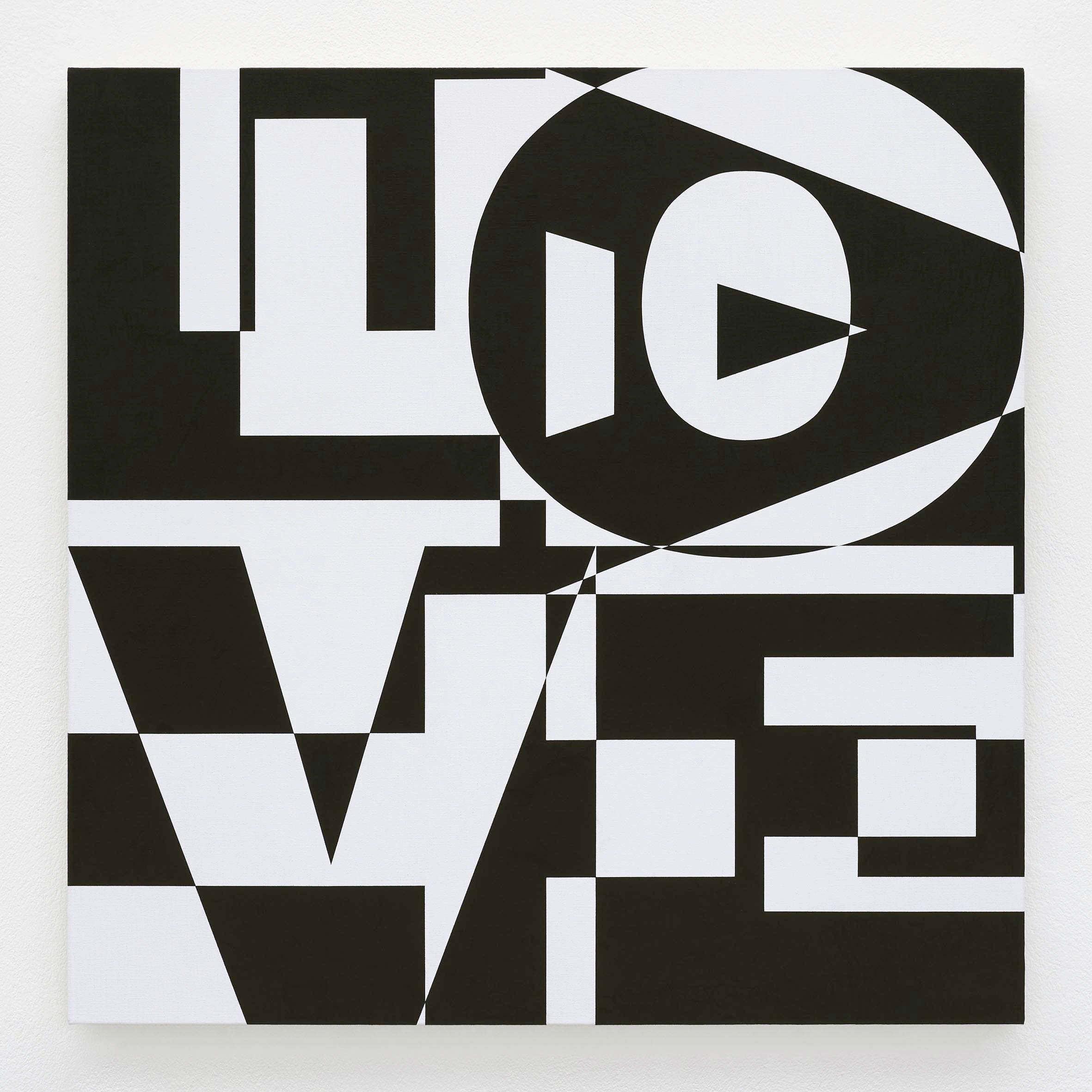
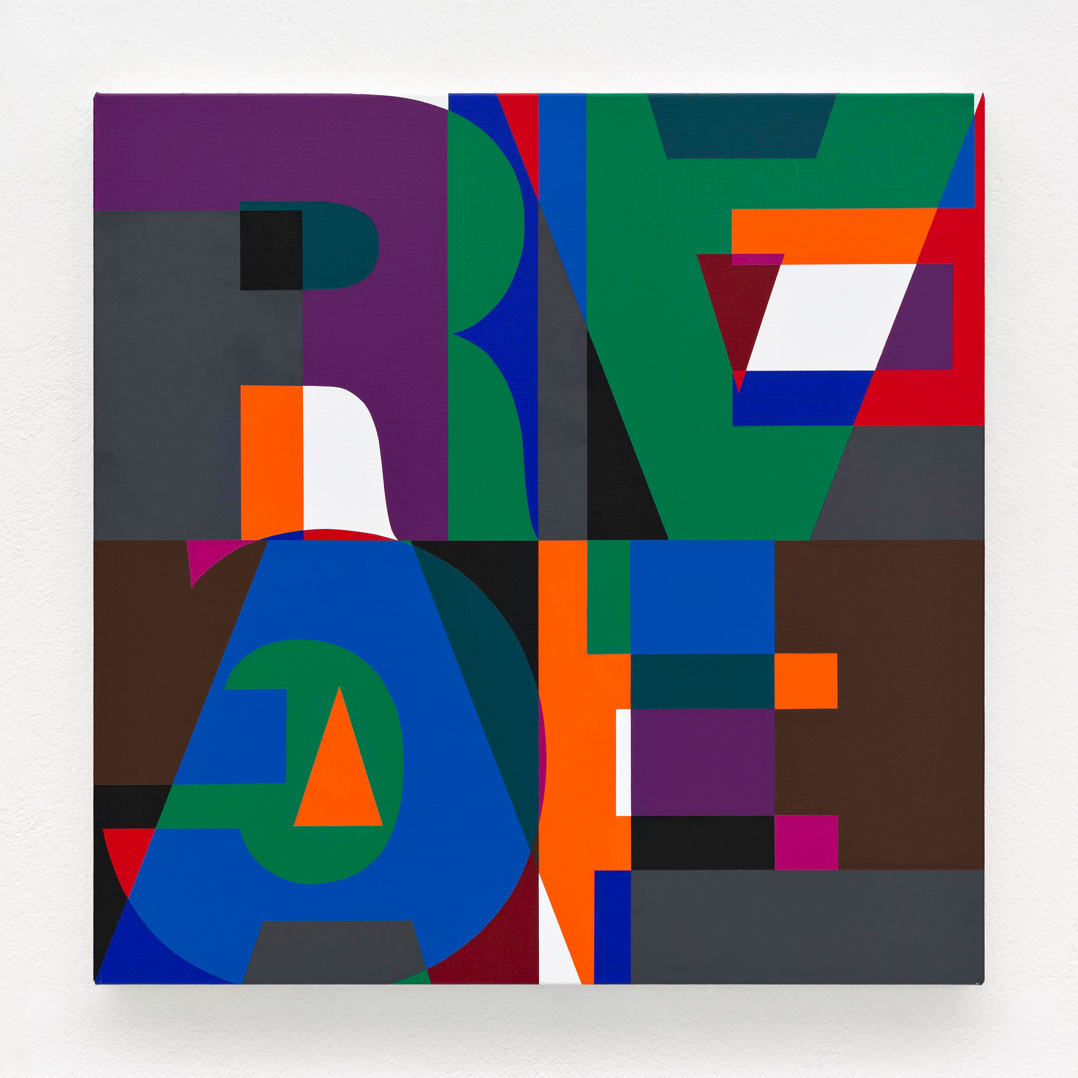
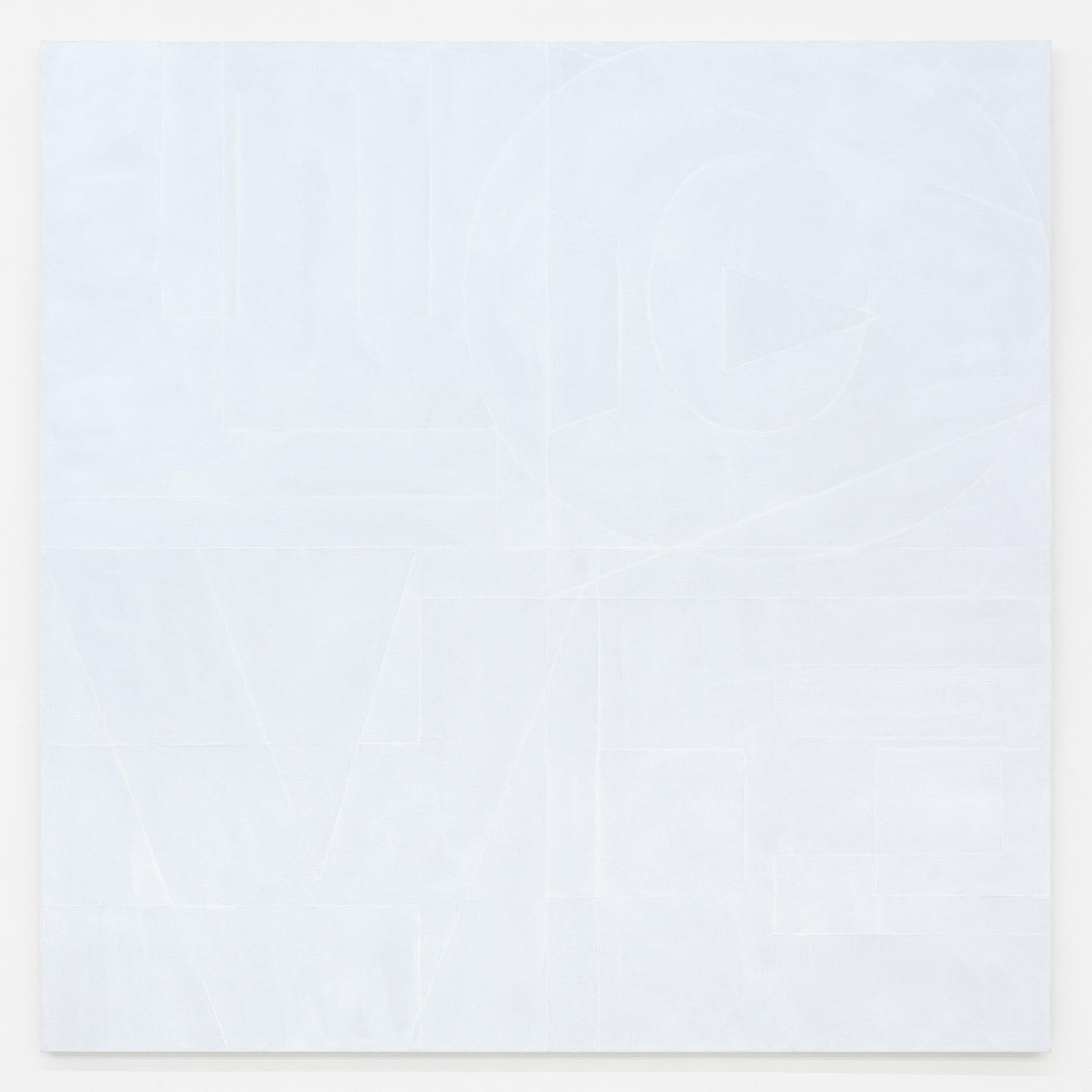
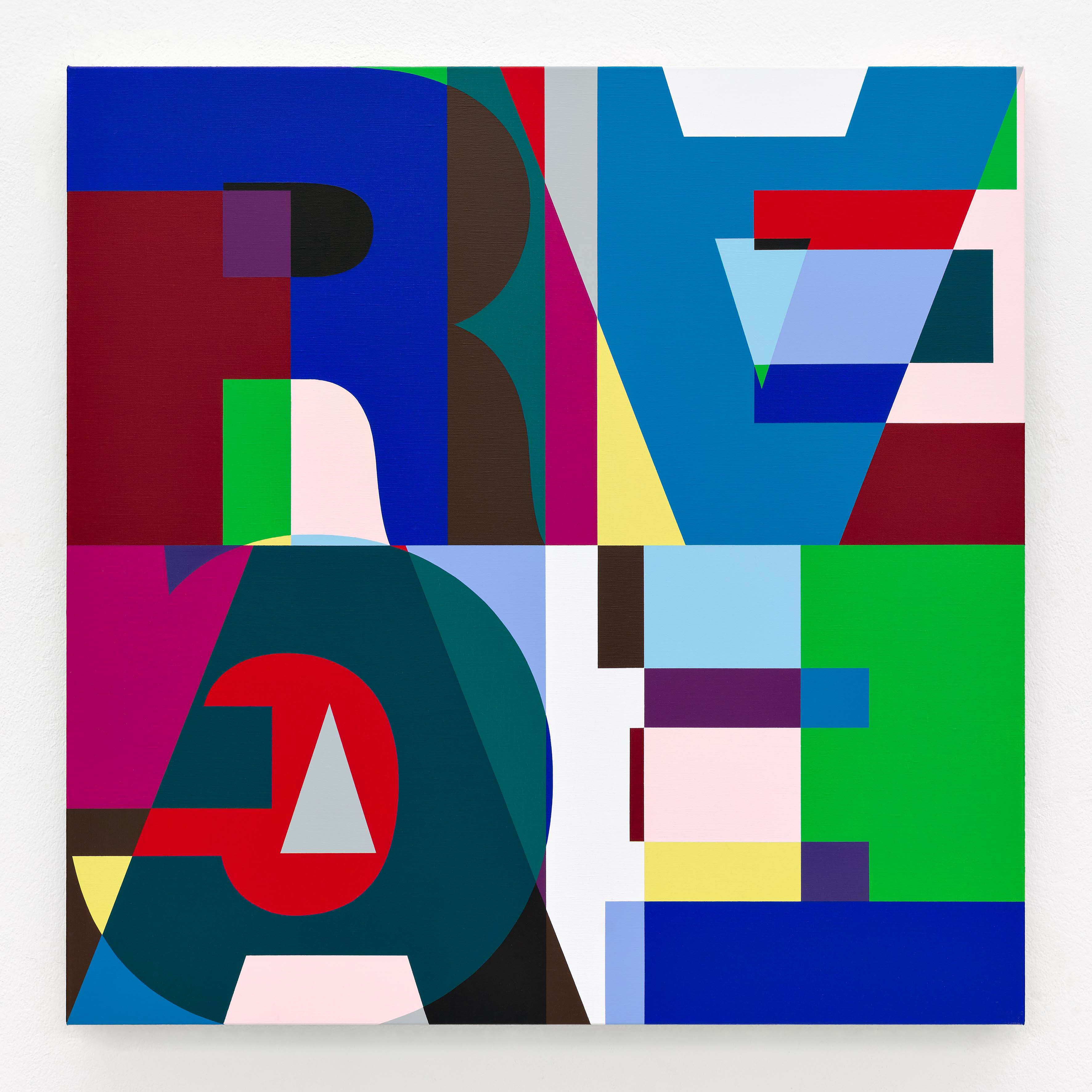
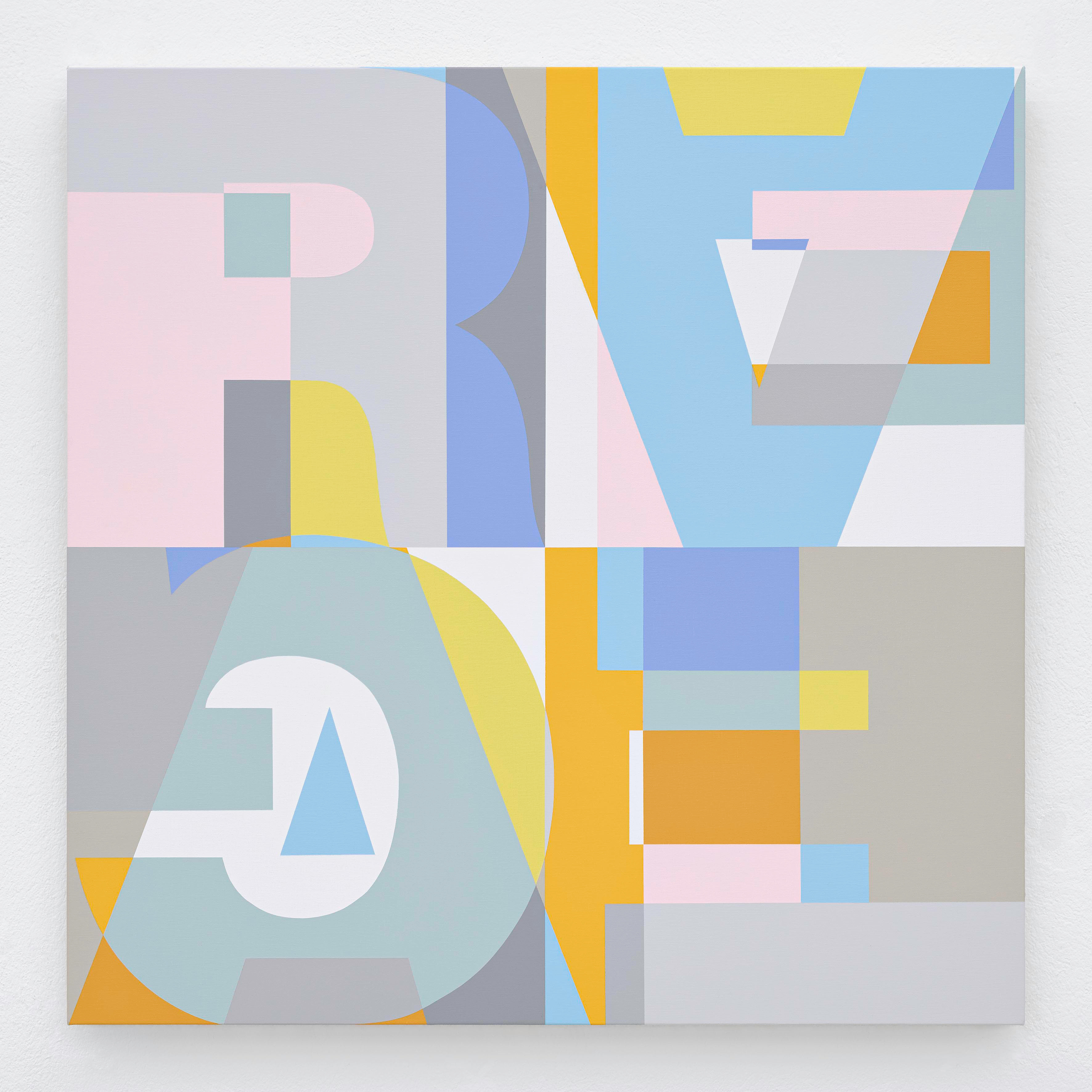
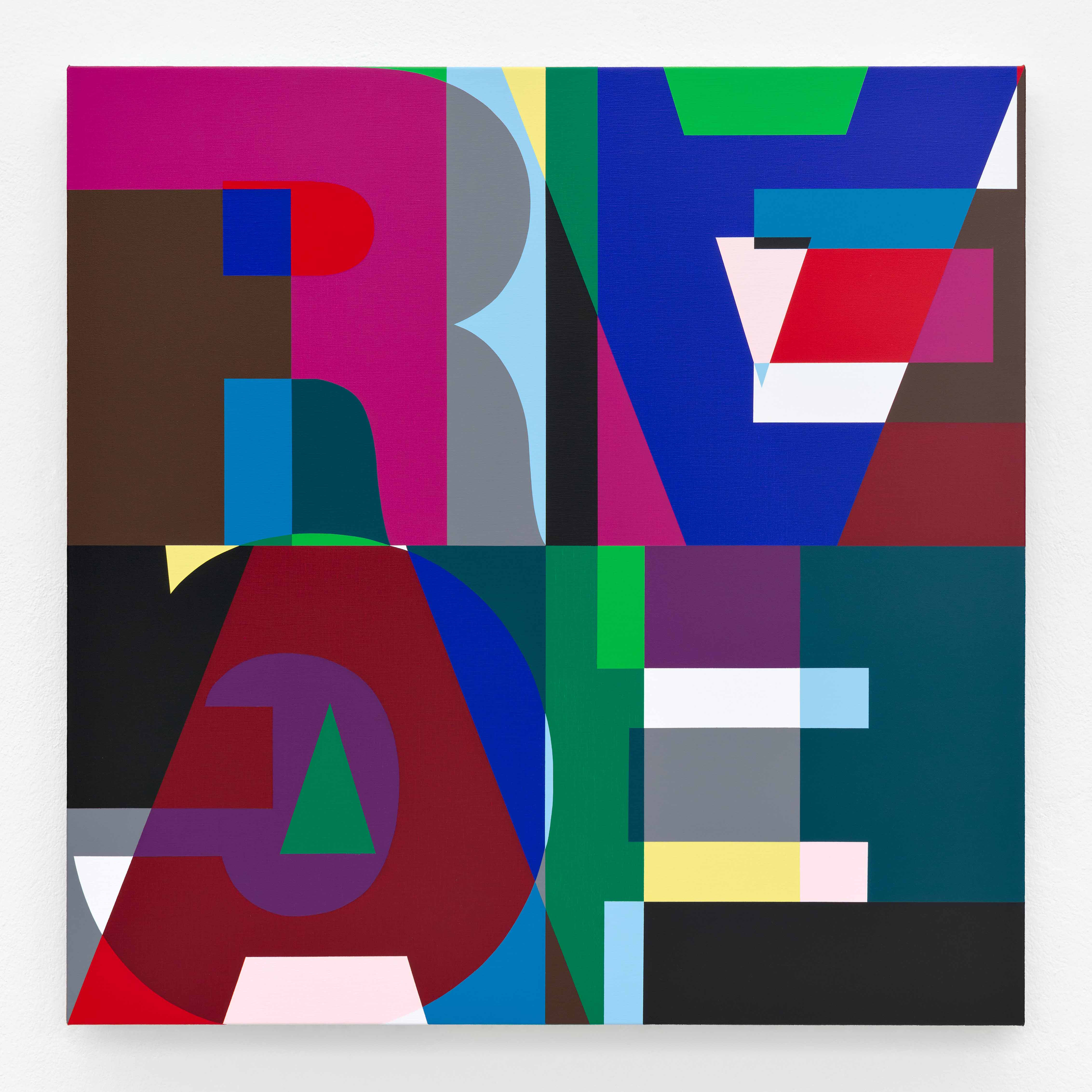
In untitled (LOVE/HATE) for example, the use of extra-bold Helvetica letters—a font typical of modernism—serves to appropriate and reinterpret Robert Indiana’s painting (LOVE, 1966), for which he had chosen a 19th-century typeface: Clarendon Bold. In 1987, Zobernig’s motif was then politically adopted by the Canadian group General Idea for an ‘Art against Aids’ campaign and adapted into an AIDS emblem.
Since 1986, Heimo Zobernig has been using the sans-serif typeface Helvetica for catalogue and poster designs. Once celebrated as an icon of the Swiss Style, Helvetica increasingly lost its prestige during the 1980s. Among typefaces, it became something like chipboard among furniture woods. Its form appears so neutral that the viewer forgets…
Exhibition Space


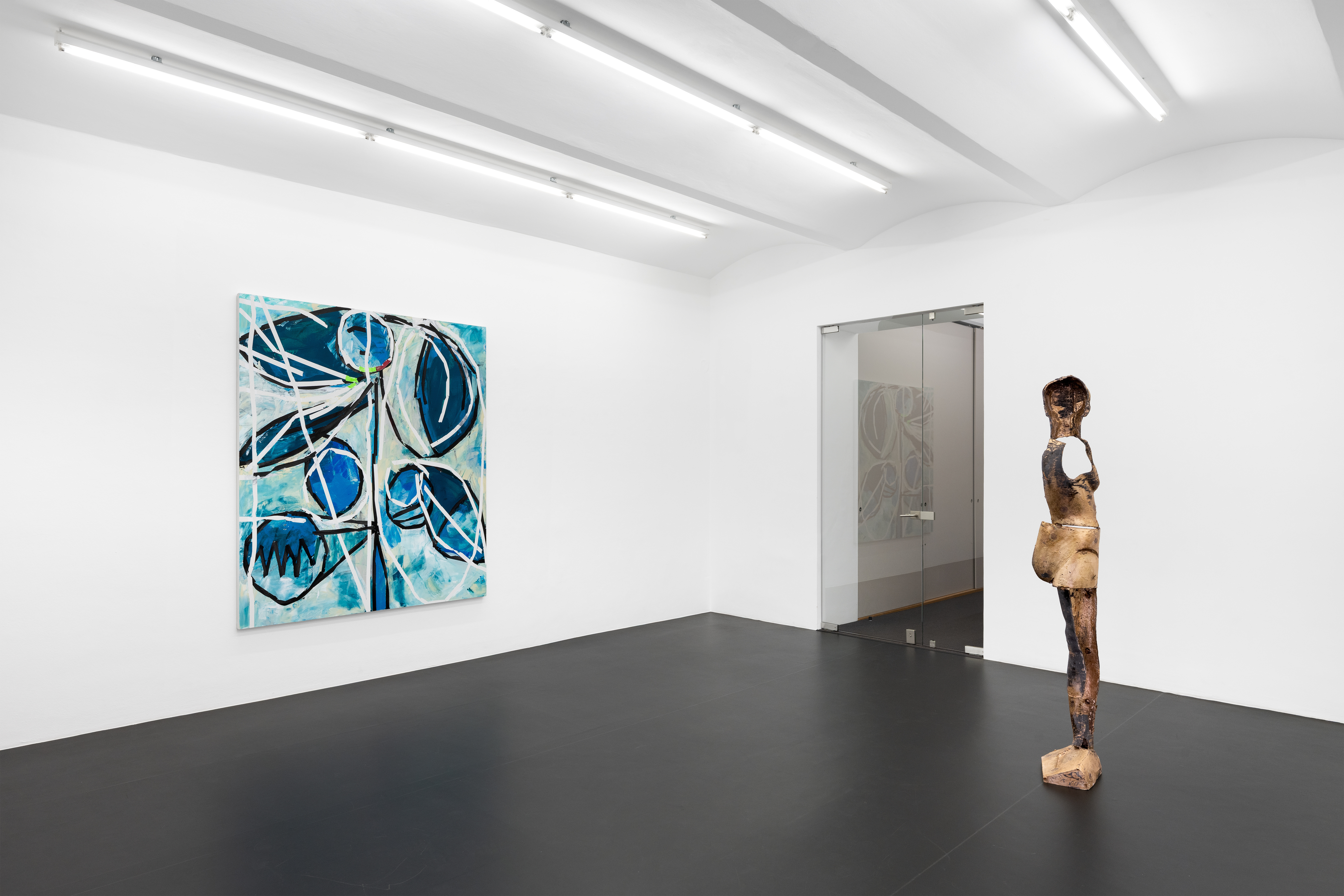
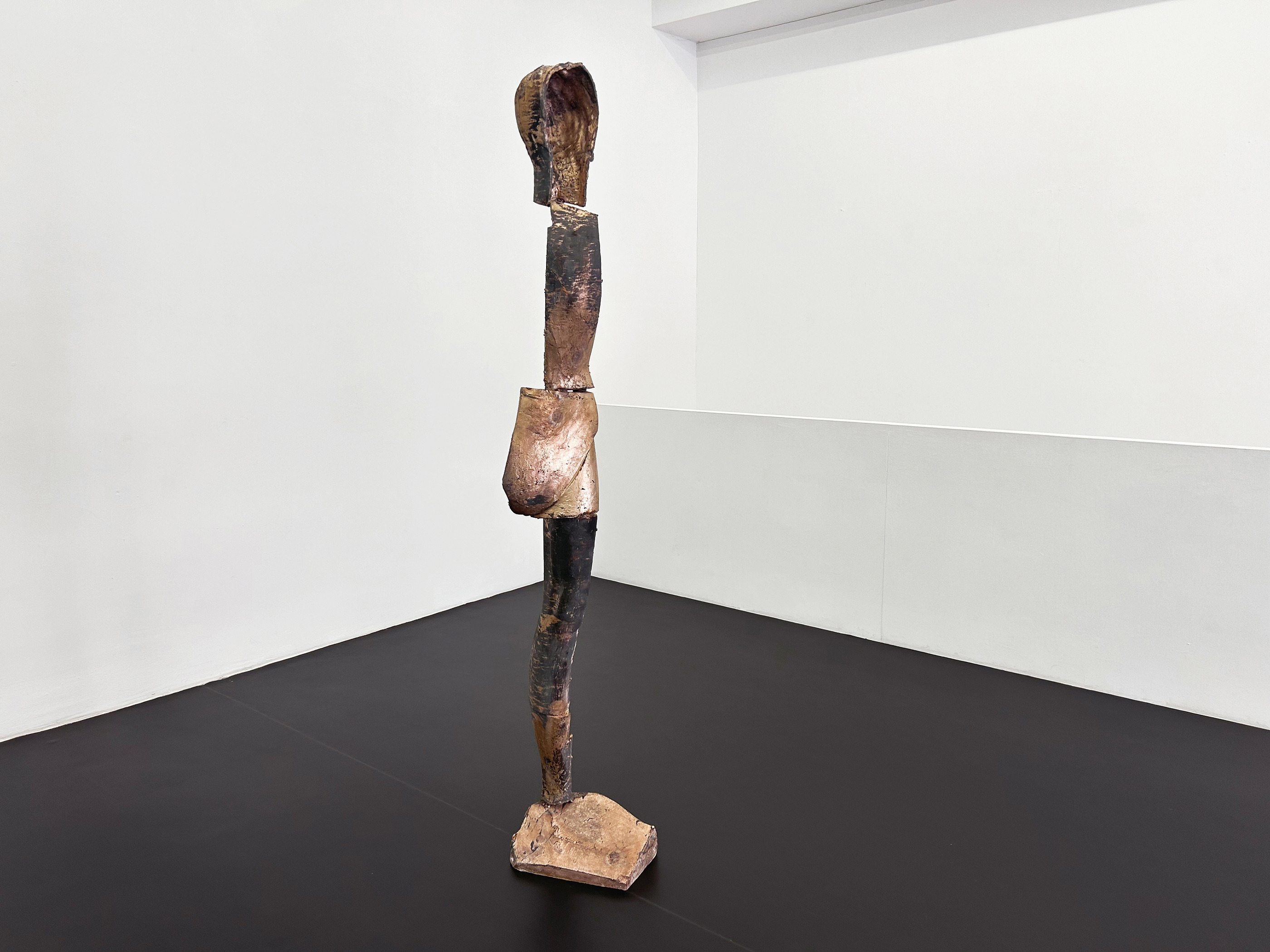
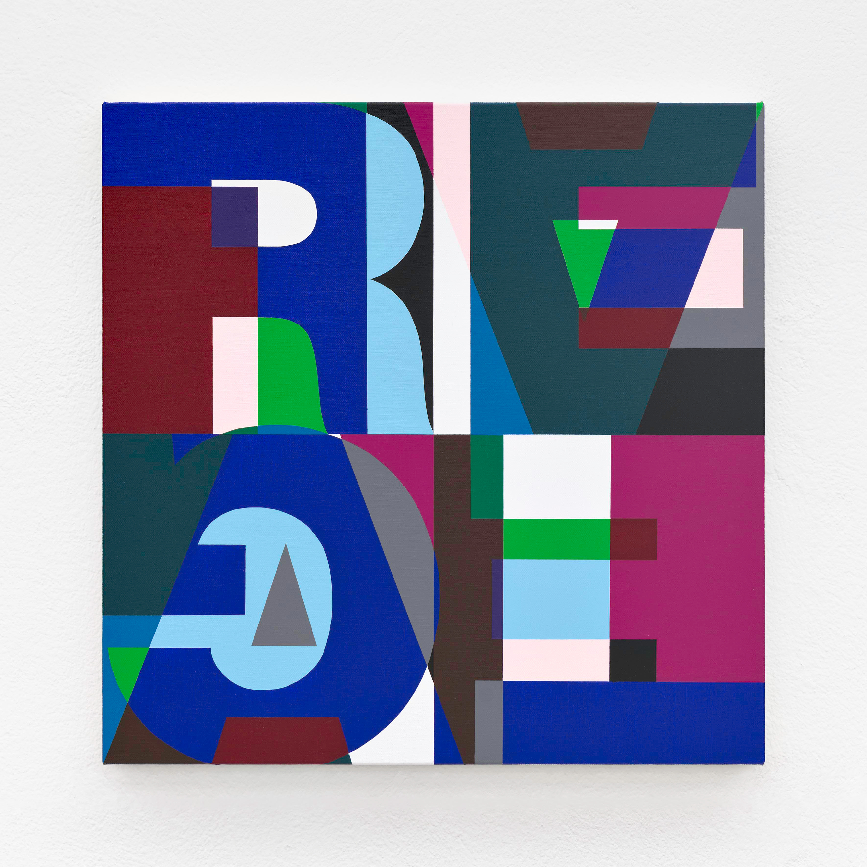
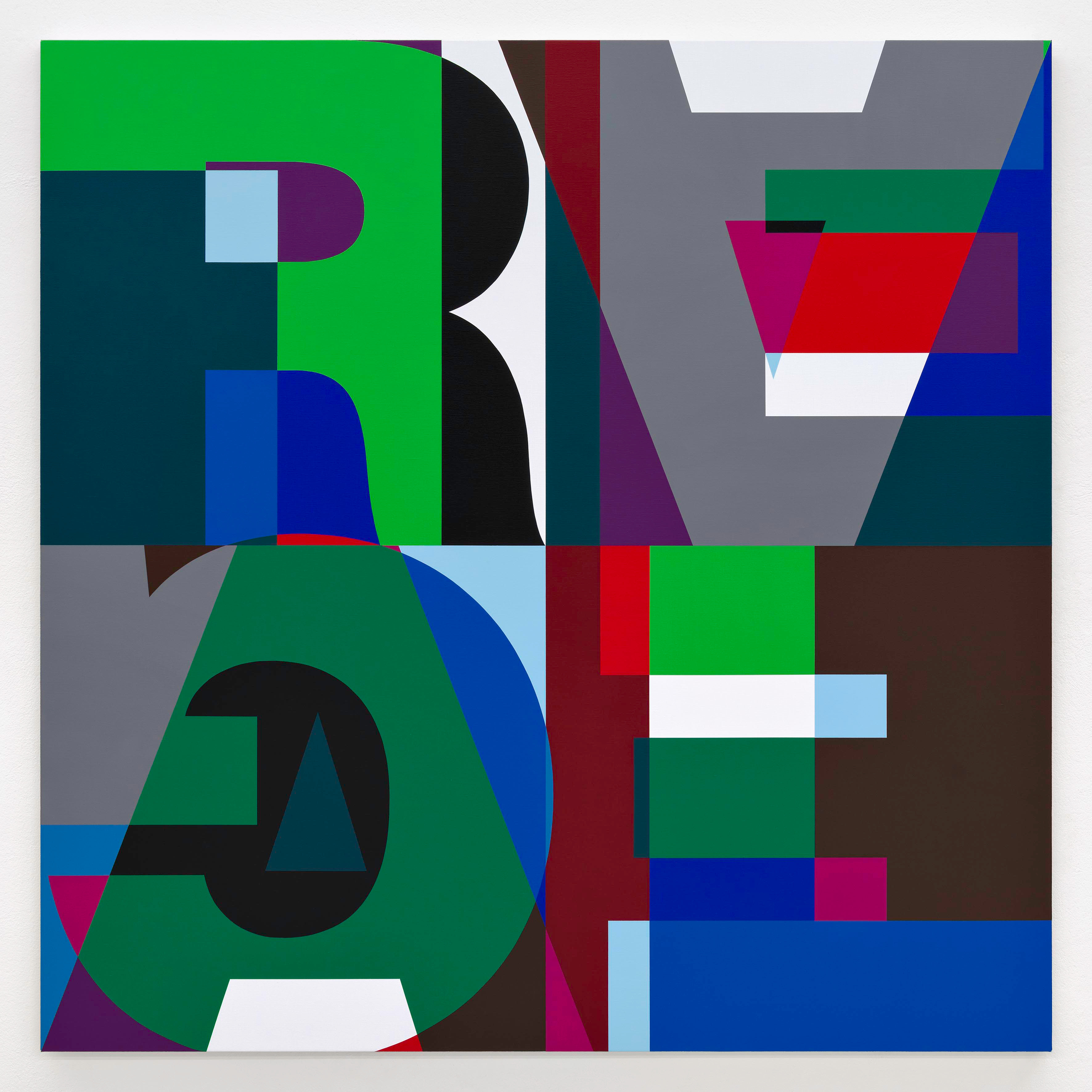


HEIMO ZOBERNIG – this not this / EI ARAKAWA-NASH – Cologne of the Maghreb (Bodyphilia Song)
Galerie Meyer Kainer•May 29, 2026 — Jul 31, 2026
Press Release
FAKING THE REAL
Since the 1980s, the ‘anti-essentialist system’ practiced by Heimo Zobernig has functioned as a consistently applied negative dialectic in his art. Within this, Zobernig regularly explores the question of the manipulation of realities.
In untitled (LOVE/HATE) for example, the use of extra-bold Helvetica letters—a font typical of modernism—serves to appropriate and reinterpret Robert Indiana’s painting (LOVE, 1966), for which he had chosen a 19th-century typeface: Clarendon Bold. In 1987, Zobernig’s motif was then politically adopted by the Canadian group General Idea for an ‘Art against Aids’ campaign and adapted into an AIDS emblem.
Since 1986, Heimo Zobernig has been using the sans-serif typeface Helvetica for catalogue and poster designs. Once celebrated as an icon of the Swiss Style, Helvetica increasingly lost its prestige during the 1980s. Among typefaces, it became something like chipboard among furniture woods. Its form appears so neutral that the viewer forgets…
Exhibition Space
More Exhibitions at Galerie Meyer Kainer
Guestbook

Editing is restricted
You cannot submit an edit because the institution hosting this exhibition has been claimed by .
Editing this section requires claiming the profile of the institution hosting this exhibition. You will need to upgrade to an Enterprise plan to submit your claim.
Claims are one of the many safeguards in place on UntitledDb that preserve the integrity of the information on our platform.For additional information on claims, click "Learn more."
Editing is restricted
Editing this section requires claiming the profile of the institution hosting this exhibition. You will need to upgrade to an Enterprise plan to submit your claim.
Claims are one of the many safeguards in place on UntitledDb that preserve the integrity of the information on our platform.For additional information on claims, click "Learn more."
Editing is restricted
A reputation of 20,000 or higher is needed to edit posts created by other users.
Familiarize yourself with our platform by creating new posts and watching your favorites. You'll reach a reputation of 20,000 in no time.
This is one of the many safeguards in place on UntitledDb that preserve the integrity of the information on our platform.
Account access options
Log in and connect with the art world
By continuing, you agree to our Terms of Use and Privacy Policy.
or
Account access options
Sign up and connect with the art world
By continuing, you agree to our Terms of Use and Privacy Policy.
or
Account access options
Expand your reach with UntitledDb Pro
By continuing, you agree to our Terms of Use and Privacy Policy.
or
Account access options
Grow your institution's reach and impact with UntitledDb Enterprise
By continuing, you agree to our Terms of Use and Privacy Policy.
or
Sign up for UntitledDb Pro to unlock this feature